Tuesday 28 October 2014

Representation of disability in Casualty (nearly finished)


In this clip of Casualty disability is represented in a stereotypical way, by representing the disabled character as not being able to do normal tasks with ease and contrasting his differences to normal people (people who aren't disabled). We are initially shown the man in the wheel chair; the mise-en-scene connotes differences between the characters, such as the attire worn by the man in a wheel chair for example, this shows that he is physically disabled indicating that he isn't capable of moving around on his own and that he has to have someone assist him around. The bright colour scheme of the shop contrasts with the  man in the wheel chair as he's wearing bland, dull, brownish coat, this further marginalises his character and makes him look different to normal, this is obviously a metaphor for how disabled people typically feel out of place in society. The way he is dressed also contrasts with how is brother is dressed, his brother fully-able brother is dressed the opposite of him as his clothes consist of crisp colours as opposed to dull colours. I think this is also a metaphor as it show's the difference/contrast between a disabled person and a normal person. 

The clip starts off with an over shoulder shot from Alex's perspective. The shot also takes his reduced height ,which due to his wheelchair, into account as the shot is taken from a low angle which looks upwards upon the other characters. This represents disability in an a-typical way as it shows a point of view from a disabled person's perspective, rather than that of a normal person. This places focus and importance on the disabled character and not the normal character which is unusual in media.  Throughout the rest of the scene the filming is consistently done at an angle which looks upwards onto characters or the shot is filmed at Alex's head height. These abnormal camera angles represent disability as being abnormal and almost represents able people as being superior to disabled people.

The editing of the scene is subtle as it utilises continuity editing. The scene constantly flips back and fourth between different characters to show how they go about their day and to show not just one but several disabled people's point of view on day to day life. This is unusual in the media because disabled persons point of view on things is not typically the main focus in many TV shows/movies.

The sound uses in this scene is mainly diegetic as there is no mood sound playing in the background, almost all of the sound used has a visible source on screen (e.g the voices of characters).  In the beginning of the clip there is the diegetic sound of Christmas themed music playing in the shop coupled with the background noise of the shop e.g people talking. 

Tuesday 14 October 2014

Representation of Gender in Luther

How are female gender/femininity and male gender/masculinity represented in Luther?


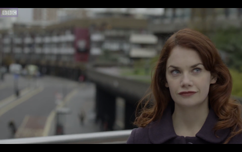
The scene of Luther starts off with an opening shot of Alice. In this shot she is the primary subject as the depth of field puts her in focus and the rule of thirds places her as the subject of the shot. The first thing noticeable about her character is her appearance; she has red hair, red lips light eyes and pale skin. To me her red-themed appearance has sexual connotations and may also connote danger. This represents femininity as sexual/seductive and arguably threatening. This is further bolstered by the non-diegetic mood sound playing in conjunction with the shot of her appearance, which is eery and sinister, connoting that Alice could be a femme fatale. 


The next shot is an establishing long shot, in which Luther and Alice are seen conversing on a bridge with several high-rises in the background. In the conversation between them Alice talks about the cremation of her dog and appears to feel very indifferent towards the loss of her pet. This does not represent femininity in a stereotypical way as stereotypically women are very attached to their pets and cause them to become emotional, Alice however is the opposite. On the contrary masculinity in this shot is represented in a stereotypical way as Luther's body language is laid back which makes him look confident and comfortable with himself. This is stereotypically a masculine trait. 


Later on the conversation continues and takes place in Alice's lounge/office. The mise en scène continues to conform to the anti-feminine representation of Alice as her apartment is stereotypically masculine in appearance. There is no pink, no patterns on the walls and no ornaments; but instead are objects/artefacts of a scientific nature. There is a telescope on her balcony, a framed diagram of the solar system on her wall and there are several book shelves. All of this coupled with the pale/sterile colour scheme and layout of her room represents her character androgynously as she clearly possesses both masculine and feminine qualities.


Within a minute or two after introducing Luther to her apartment, Alice tries to sexually advance upon Luther. As she explains to Luther an artistic representation of a blackhole on her wall she clearly uses it as a metaphor to reference her femme fatale prowess. She describes the blackhole as drawing in matter and destroying it, much like a femme fatale seduces a man and leads him into a dangerous situation. This represents her femininity as sexually exploitive and unusually powerful in comparison to typical male-female power dynamics. In this frame a two shot with a zoom camera movement is used to represent how Alice is seducing Luther.


In this scene Luther is represented un-stereotypically as he is represented as possessing atypical traits for a man. This is evident from he way he never gives in to Alice's sexual advancements and constantly resists her trying to seduce him. In this scene masculinity is also represented in an atypical and submissive fashion as there is a constant power struggle between the male and female character. This is unusual as typically the man is usually the dominant one and the woman is submissive.


Monday 29 September 2014

Why did Dredd Fail at the Box Office?

Dredd is a 2012 British-South African science fiction film set in a dystopic American city called Mega City One, in which its 800 million inhabitance mostly consist of criminals, gang members and drug lords. It was based on the not so famous British comic strip 'Judge Dredd' and was distributed by Lionsgate and Entertainment Film Distributors. With a budget of $41 million USD and only grossing $41 million USD worldwide during its theatrical run, Dredd turned out to be a massive box office failure.

Dredd was produced by Alex Garland, Andrew MacDonald and Allon Reich. It was scripted by Alex Garland and was distributed by Lionsgate and Entertainment Film Distributors. The films producer and script writer, Alex Garland, was the same man who produced the films Never Let Me Go and 28 days later. The film's distributor 'Lionsgate Film' is a Canadian-American entertainment company owned by the Lionsgate Cooperation. The company is well known for the distribution of famous films such as the Hunger Games. The film was produced by several production companies, these include IM Global, DNA Flims and Reliance Entertainment. IM Global is one of the worlds leading film financing, sales and distributing companies and is largely owned by Reliance Entertainment. DNA Films is a British film production company which was founded by a joint venture between Fox Searchlight and Alex Macdonald &  Duncan Kenworthy. 

The film arguably starred only one famous actor which was Karl Urban who played the role of Judge Dredd, his face was not shown once throughout the entire film which most likely removed the beneficial effects of his fame. The film also starred Olivia Thirlby who isn't particularly famous and probably did not benefit the films publicity. I believe the casting of unknown actors in Dredd is one of the factors that contributed to the film's box office failure. Often, people will only go to watch a film if they know at least some of the actors which play certain roles. In the case of Dredd, the only well known actor who was casted was not identifiable, I think this limited the film's audience as people were generally unfamiliar with who was casted for it and thus didn't go to watch it. 

When it came to marketing I believe that Dredd was limited right from the beginning due to the very few marketing campaigns utilised by its distributors and due to poor advertisement of the film. The only marketing campaigns that were pursued by the film's advertisers were a comic strip about the film and an online trailer for the film. This led to the film having very little publicity and was overshadowed by the publicity of rival films such as The Avengers, The Amazing Spiderman and The Dark Knight Rises.

Another factor that I think contributed to Dredd's poor box office performance was that almost all showings of the films were in 3D.  This I believe had an effect on the number of people that chose to watch the film as a large majority of people prefer not to watch films in 3D. Even when certain cinema's requested for a 2D version of the film Dredd's distributors (Lionsgate) refused to send one. This was quite a stupid thing to do as it was obviously going to limit the amount of showings of the films and limit the amount of cinema's that showed the film. And thus, limit their profit that they'd make from the film. 

During Dredd's theatrical run the film was met with overwhelming competition from rival block busters such has The Dark Knight Rises and Skyfall which I believe impacted the films box office performance.

The Dark Knight Rises was produced by Christopher Nolan, Emma Thomas and Charles Roven. It was also directed Christopher Nolan who also wrote the script in partnership with David S. Goyer. The film starred many famous actors such as Anne Hathaway, Michael Caine, Tom Hardy and Gary Oldman. The Dark Knight Rises had a newsworthy budget of $300 million dollars and grossed $1.08 billion during its theatrical run; a massive box office success unlike Dredd. The Dark Knight Rises was based on the well known and famous comic book super hero Batman and was the last instalment of Christopher Nolan's Batman Trilogy, so it was bound to be a success right from the get go. 


Sunday 28 September 2014

Representation- Lester Burnham

Mise En Scene/Camera Shots

In the first shot the mise en scene reveals a lot about how Lester Burmham's character is represented. The lighting is very dark and shadowy on his side of the bed, which could indicate that he is in a dark period of his life and could represent him as being unhappy/depressed. The colour scheme of the mise en scene consists of dull and monotonous shades of white. I believe this represents a possible emptiness that his character is feeling, and could represent how dull and monotonous his life is. The camera shot used in this scene is a birds eye view/long shot.


In this second scene a 'two shot' camera angle is being used as it features two main subjects. Out of focus is Lester Burnham, spying on his wife behind a window that reflects that of prison bars. This could represent that Lester feels like he is trapped in his life or that he feels as if his life has been taken away from him. The mise en scene has a very obvious colour scheme of red, white, and blue. There are also American Beauty roses everywhere, which links to the title of the film (American Beauty).


Sound

Throughout the opening scene, the non diegetic soundtrack called 'Dead Already' plays in the background. This soundtrack has very repetitive and monotonous nature to it, which could represent Lester's mundane life. On the contrary, the soundtrack does sound upbeat and lively, which could've been deliberately used as a form of irony (because Lester's life is not upbeat nor lively). Alongside the soundtrack is the voice of Lester Burnham narrating the scene which is also non diegetic.

Textual Analysis and Representation (The 7 key areas of representation)


You need to understand how these technical elements (in the last post) create specific representations of individuals, groups, events or places and help to articulate specific messages and values that have social significance. 

Particular areas of representation that may be chosen are:
  1. Gender
  2. Age
  3. Ethnicity
  4. Sexuality
  5. Class and status
  6. Physical ability/disability
  7. Regional identity

Textual Analysis and Representation (The 4 key areas of textual anaysis)

Camera Shots, Angle, Movement, Composition
  • Shots: establishing shot, master shot, close-up, mid-shot, long shot, wide shot, two-shot, aerial shot, point of view shot, over the shoulder shot, and variations of these.
  • Angle: high angle, low angle, canted angle.
  • Movement: pan, tilt, track, dolly, crane, steadicam, hand-held, zoom, reverse zoom.
  • Composition: framing, rule of thirds, depth of field – deep and shallow focus, focus pulls.
Editing


Includes transition of image and sound – continuity and non-continuity systems.
  • Cutting: shot/reverse shot, eyeline match, graphic match, action match, jump cut, crosscutting, parallel editing, cutaway; insert.
  • Other transitions, dissolve, fade-in, fade-out, wipe, superimposition, long take, short take, slow motion, ellipsis and expansion of time, post-production, visual effects.
 Sound
  • Soundtrack: score, incidental music, themes and stings, ambient sound.
  • Diegetic and non-diegetic sound; synchronous/asynchronous sound; sound effects; sound motif, sound bridge, dialogue, voiceover, mode of address/direct address, sound mixing, sound perspective.
Mise-en-Scène
  • Production design: location, studio, set design, costume and make-up, properties.
  • Lighting; colour design.

My 5x5

5x5 TV Shows

Friends- A classic sitcom from the 90's, it's one of those tv shows where it doesn't matter if you've watched it before; it will still make you laugh 

Frasier- Another classic sitcom from the 90's, it may not be as well known as friends (especially not with my generation) but I find it hilarious and its intelligent sense of humour never fails to entertain

Battlestar Galactica (2004) - this sci-fi drama from 2004 is probably one of the best t shows I have ever watched, it may be a bit to sic-fi for some, but you don't have to be into sci-fi to appreciate its amazing story arc, incredible acting and impressive special effects

Misfits- this show always makes me laugh, it's edgy humour and good acting make it one of my favourite things to watch

Skins- it may portray teenage life in a very stereotypical way, but it's just one of those shows that never gets old

5x5 Movies

Pulp Fiction- one of the best Tarantino films ever, the script writing is impeccable and it's non linear story arc is intriguing (the beginning of the film is the end of the film)

Kill Bill Vol.1- though it's fight scenes maybe a little long winded, its cheesy gore and it's black humour always make me smile 

American Beauty- this film had so many plot twists that it didn't seem like it was 2 hours long, every single one of its characters were deep, complex and likeable, no wonder it one best picture of 1999

Bladerunner- this one of my favourite Ridley Scott films, I a film noir from the 80's, I really like the art style of the film and how dark it is, the cinematography is also really impressive 

Lost in Translation- I don't usually like romance films but this film is an exception, the film has really good acting and I also like how it is set in Tokyo and explores Japanese culture 

5x5 Characters

Mia Wallace- There's not many people that can make overdosing on heroin look as glamorous as she did, she's smart, mysterious, stylish and charming, that's why so many people think of her as a main character in pulp fiction, despite her fairly short role in the film 

Vincent Vega- Another character from Pulp Fiction, his dry sense of humour and ability to keep his cool (despite shooting Marvin in the head) make him instantly likeable 

Lester Burnham- his deep dissatisfaction with life and pretty much everything makes him relatable and his indifference towards the way he acts after years of conforming makes him hilarious 

The Bride/Beatrix Kiddo- Her strong determination to get revenge and kill the people who betrayed her and willingness to slaughter anyone who gets in her way make me laugh (I'm not sure why, I'm not a psychopath I promise) 

Yoda (episode V)- He's a small, green and cheeky (perceptive, I know) 

5x5 Websites

Twitter- keeps me informed with what people are talking about and delivers lots of entertainment into my day, I'm always on it 

Tumbr- keeps me up to date with fashion and what looks good, also provides a wide variety of media  and just generally entertaining things 

Instagram- Allows me to share good photo's I've taken of various things 

Youtube- this website keeps me entertained for hours at a time

BBC news- keeps me informed with current affairs and is one of the more unbiased and reliable news broadcasters 

5x5 Actors

Harrison Ford- He always portrays his characters well and manages to create a very likeable character 

Helena Bonham Carter- he portrayal of Bellatrix Lestrange in the Harry Potter film series was very impressive, she is one of the few actor's that actually ACT rather than just acting like themselves, she also comes across as very intellectual and down to earth in her interviews 

Jennifer Lawrence- Her acting in Silver Linings Playbook won her on oscar and quite rightly so, she is very talented but she is also very humble, judging from her interviews. She hasn't let her new founded fame get to her head and she's just generally a very likeable person 

Simon Pegg- His films are always quality and his character always has me in hysterics, he's witty, funny and a very good actor. His best piece of acting in my opinion was the portrayal of his character in Shaun of the Dead

Stephen Fry- Though his acting may not be the best (although it is good), I just generally like him as a person as he's down to earth and is very intelligent. I especially like his TV show Qi